In the early 1980s, Jim Esben Andersen – a close friend of Gunnar Håmsø and a student at the Bergen School of Arts and Crafts – was given the task of developing a corporate identity. He chose to create one for Håmsø Patentbyrå, designing a logo that has stood the test of time and remains in use more than 40 years later.
The logo was drawn by hand with technical precision and carefully constructed using a rOtring pen, long before digital design tools existed. It was a time-consuming and detailed process – and highly unusual, even groundbreaking, for a patent firm to have a custom-designed logo at that time. The design signalled that the firm had a conscious approach to identity, aesthetics, and communication.
A distinct visual identity
Hardly any other patent firms – in Norway or internationally – had their own logo at the time, which attracted significant attention. With roots in graphic craftsmanship and a deep respect for form and function, the logo communicates not only aesthetics, but also the core of what Håmsø Patentbyrå stands for:
Protecting and managing ideas – always in motion.
A symbol with purpose
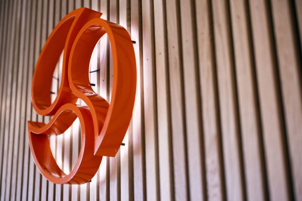
According to the designer, the logo is inspired by yin and yang, consisting of three rotating, organic shapes that balance each other in an eternal interplay. It evokes associations with duality and harmony, but also with dynamism and forward movement. The form can be read as an eternal circle – a symbol of the creative cycle and the boundless flow of new ideas.
Celebrating a legacy of craft and vision
In the anniversary year 2025, as Håmsø Patentbyrå marks 75 years of providing advice, patents, and trademark protection, it is worth reflecting on this visual identity – developed with craftsmanship and insight, and carried forward as an integral part of the firm’s identity and cultural heritage.
The core shape of the logo has remained largely unchanged since its creation, but the colour and typography have evolved over time. The original green tone was eventually replaced with orange, and the typeface was adjusted to better suit digital platforms – yet the main visual symbol endures.
The anniversary is also an opportunity to dive deeper into the story behind both the firm and its visual identity. We’ve gathered a selection of moments and milestones from our first 75 years on a dedicated anniversary page – for those curious about Håmsø Patentbyrå’s journey and how we’ve evolved with the times.